
Preface
But it is powerful, isn’t it?
One of the main points I want to talk about to her is the
difference between what is SEXY and what is merely SKANKY. Here’s what I mean:
Sexy
SEXY IS enticing, inviting, surprise, promise, hinting, healthy
balance, vibrant, real, thrives in relationships, well-groomed yet natural, vital,
energetic... and includes (unfortunately for definitions) a healthy dose of je ne sais quoi.
Examples of SEXY ARCHITECTURE:
 |
| Milwaukee Art Museum by Calatrava Image courtesy of Thomas Hawk via Flickr |
- Slightly hidden entryways whose path is easily discovered, but whose door is sheltered. The way in is hinted at, but not seen from the street.
- Foyers large enough for pausing, but not imposing. The point is to have a glimpse of what is further inside... and the hope is to be invited.
- Landscaping that defines and protects the property without seeming unwelcoming. Again, a glimpse should show/invite to what ideally is your own private oasis.
- Playful details that delight the senses: the sound of rain runoff filling a birdbath from a spout, the slow dance of diurnal daylight across a south-facing room with multiple windows, the smell of fresh spring air through a breezeway, the texture of a hand-plastered wall.
- Private nooks for one or two people with a view or a small library, or just visually/acoustically protected.
― Courtney E. Martin
Skanky
SKANKY IS obvious, revealing, garish, mono-dimensional, unrealistically-fantasy-driven, aggressive, egocentric; its good qualities are too-heavily emphasized with
paint and fashion.
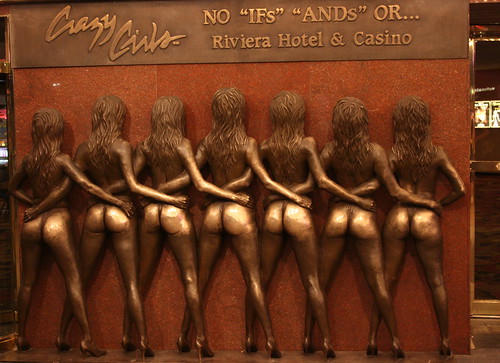 |
| Signage at the Riviera Hotal, Las Vegas. Image courtesy of daBinsi via Flickr. |
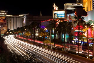 |
| Sin City Image courtesy of Tord Sollie via Flickr |
- Entries that are enormously out of scale, meant to impress. Entries which contain all that is good about a place; everything beyond is a letdown.
- Too many windows; or, any windows with faux "divided light."
- A garage door that should be hidden and instead dwarfs the entry (this is only a slight reference to the signage pictured at right).
- Showing off all assets at once, rather than expecting that someone will have the patience to discover them one by one.
- Spending the most money on a rarely used public room (the equivalent of a neon sign) rather than where the inhabitants spend most of their time.
- Using a cheap material like styrofoam to mimic elaborate details on a facade.
- Using the most expensive material for a job rather than the most appropriate, simply to show off wealth.
- Lighting or colors that are excessively bright and attention grabbing rather than in moderation.
- Building forms that vie for prominence rather than work together as a balanced collection.
Uptight
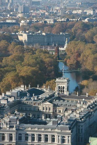
 |
| Queen Victoria courtesy of Ross Dunn via Flickr |
Examples of UPTIGHT ARCHITECTURE:
- Perfectly symmetrical white-column classic revivalism: even the landscaping is perfectly groomed and symmetrical.
- Sharped-edged white-plane modernism: neither blemishes nor inhabitants welcome. These are not meant to be lived in, but photographed for magazines.
- Twelve-foot ornamental fences that still give off the vibe of razor wire: you are not welcome here.
- Those grass lawns that are perfectly groomed and never used.
 |
| Vittori Emmanuele II Monument by Storm Crypt via Flickr Managing to be skanky and uptight at the same time! |
-ally
P.S.
In defense of my choice, Vegas has been the subject of a popular 1972 architectural treatise called Learning from Las Vegas. The main point of it is that perhaps UPTIGHT architecture could learn a thing or two from SKANKY architecture. I guess I'm proposing somewhere in between.
-ally


No comments:
Post a Comment